


The Arizona Daily Star's analysis of migrant deaths in Arizona provides additional evidence that the journey for migrants has gotten more dangerous over the last three decades.
The Star looked at all migrant deaths on record since 1990 in Arizona border counties by combining data from the Yuma County Sheriff's Office with data from the remainder of the counties, which the Pima County Medical Examiner's Office and the aid group Humane Borders publish.
The Star overlaid these deaths onto different kinds of maps. Some were common maps that show cities and roads. Others showed outlines of mountain ranges, cell phone coverage and border walls.
We found that, since 1990, migrant deaths have been discovered in increasingly remote areas, further from roads and further from towns and cities. Many have been found in the mountains. And at least 500 died in areas without cell phone coverage.

The Star also used data from these maps to build statistical models to explore why deaths were trending to more remote areas. The models provide additional statistically significant evidence that border fencing and walls have pushed migrants into these areas.
Key basic findings:
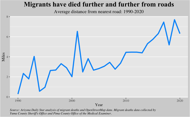
- Deaths have been discovered further and further from roads. For each death, the Star calculated the distance from certain types of roads in the OpenStreetMap database. Due to the remote nature of some backcountry roads, we included those defined as “motorways” through “tertiary” roads.
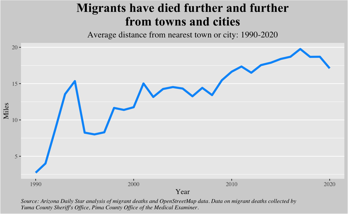
- Deaths have been discovered further and further from towns and cities. For each death, the Star calculated the distance from Southern Arizona’s cities and towns in the OpenStreetMap database.
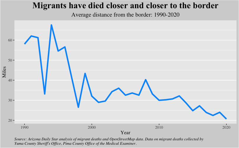
- Deaths have been discovered closer and closer to the U.S.-Mexico border. For each death, the Star calculated the distance from the U.S.-Mexico border.

- Nearly half of all deaths were found in the mountains. The Star mapped deaths over mountain range maps created by the United Nations Environment Programme World Conservation Monitoring Centre.
- Over 500 migrants have died in areas that did not have cell phone coverage as of June 2020. The largest area without cell phone coverage in Southern Arizona was in and around the Cabeza Prieta National Wildlife Refuge. To find this, the Star used GIS software to plot migrant deaths over coverage maps that wireless companies provide to the U.S. Federal Communications Commission. The 2021 coverage maps give a highly conservative estimate of the coverage available where a migrant died in the years before June 2020. Even more people have likely died in areas without cell coverage. Coverage has expanded over the years, so deaths in past years had a higher chance of being discovered in areas without coverage.
- Migrant deaths in Arizona’s border counties are found in a small fraction of the 27,500 square miles across these counties. Every year since 2000, at least 50% of the remains were found in less than 8% of those 27,500 square miles; in some years it was as little as 3% of that area.
The Star’s statistical models
The Star used a regression analysis in two models to explore the relationship between border walls, the remoteness of deaths and the number of deaths from 2015 to 2020.
Both models’ dependent variable is the number of deaths in a cross-border corridor by year. The Star used corridors as outlined by Humane Border, which are based on watersheds, since these corridors act as natural migration funnels.
The Star’s two independent variables are:
• A corridor's share of Arizona's unwalled border in a given year. This is found by dividing a corridor's miles of unwalled border by Arizona's total miles of unwalled border in a given year. We did not use the actual length of the border wall in each corridor because it wouldn’t necessarily show how many miles of border are walled due to double- or triple-layered wall segments. The Star classified border “walls” and “pedestrian fencing” in the same way since these bollard-style barriers differ primarily in their height and have the same effect on migrants traveling on foot. To analyze wall length, the Star combined wall data made public through a Freedom of Information Act request by KPBS and inewsource, along with newer wall data compiled the Border Coalition Mapping Group. The Star used the year construction started on a wall segment to map Trump-era walls by year. This was found by referencing data the Star received from the U.S. Army Corps of Engineers through a records request. We limited our analysis to 2015-2020 because the older dataset we used is a snapshot of barriers at the time it was made public and the newest segment in this dataset is from 2015.
- The average distance of all deaths from the nearest town or city in a corridor by year. This is used as a measurement for remoteness. All places defined as cities and towns in the OpenStreetMap database are used as possible “nearest” towns or cities. As a note: Small places defined as hamlets and villages along the border in Arizona, such as Lukeville, Naco and Sasabe and not included due to their remote nature. The Star calculated distance using the latitude and longitude of the point associated with a city or town, if the boundary was not available.
Findings
From 2015 to 2020, the Star found a statistically significant, positive relationship between the number of deaths in a corridor and a corridor's share of Arizona's unwalled border. The Star also found a statistically significant positive relationship between the number of deaths in a corridor and those deaths’ average distance from the nearest town or city.
In other words, the Star found additional evidence that border walls and pedestrian fencing have contributed to funneling migrants into more remote areas, a phenomenon previously studied by academic researchers and one that was predicted by officials in the Border Patrol Strategic Plan 1994 and Beyond: National Strategy.
Using data from 2015 to 2020, the Star built two statistical models to examine how border walls and remoteness may impact migrant death counts.
The Star found cross-border migration corridors that have more of Arizona’s unwalled border also typically have more deaths than other corridors in a given year. And more deaths tend to be found in corridors where deaths are more remote in a given year.
Walls and Arizona's unwalled border
The first model estimates that a 1 percentage point increase in a corridor’s share of Arizona's unwalled-border typically increases deaths by about 4%.
For example, the migration corridor west of Lukeville currently has the smallest share of Arizona's unwalled border. Nearly all of it is walled off. Effectively, its share of Arizona's unwalled border is 0%.
Meanwhile, the corridor west of Nogales, where Sasabe is located, currently has nearly 4 miles of Arizona's unwalled border, which is about a 3% share of unwalled border across the state.
Based on data from 2015 to 2020, our model expects that if the corridor west of Lukeville had 10 deaths in a year, the corridor west of Nogales would have 14% more deaths in the same year, or about 11 deaths total.
Remoteness: Average distance from cities or towns
The few corridors without walls are all remote, away from urban centers along the border. To quantify remoteness, however, the Star took all the deaths in each corridor and calculated their average distance from the nearest town or city by year.
Our model expects that a one-mile increase in this distance typically increases the number of deaths in a corridor by about 1.6% in a given year, based on data from 2015 to 2020.
For example, this model would expect that a corridor where deaths averaged 10 miles from towns or cities would have about 14% more deaths than a corridor where deaths averaged 1 mile from towns or cities, the least remote of any other corridor in that year.
Since 2015, on the east side of the Tohono O'odham Nation, deaths usually averaged about 15 miles away from the nearest town or city, which was a bit less than the yearly average across all corridors.
Even though this corridor is typically the most deadly, deaths there were not the most remote there, due to their proximity to Sells.
However, death counts were high enough and remote enough in other corridors in other years for our model to identify the trend: As distance from cities and towns increases, deaths counts in a corridor tend to increase too.
Methodology
Both models use quasi-poisson distributions with fixed effects for their regression analysis.
To model the probability of migrant deaths in corridors along the border, ideally researchers would use a binomial distribution, if we knew the number and location of attempted border crossings, along with the number of successful trips. However, very little data on migration is available to the public at such a granular level. And the true number of attempts will never be available.
The number of Border Patrol encounters with migrants would be the best data to approximate how many migrants have crossed the border and where they attempted to do so. These data, however, are only available at the sector level and won't help us understand where migrants are crossing. Sectors are large areas that encompass multiple corridors, which are typically separated by mountain ranges. One corridor even overlaps both sectors in Arizona.
The public is left with counts of migrant deaths that have been found and reported to medical examiners. A Poisson distribution is typically used to model count data.
However, the mean of a poisson distribution must equal the variance, which doesn't happen often in real-life datasets. When this doesn't happen the data are overdispersed.
In the case of migrant deaths, this means that the rate at which deaths are found does not stay consistent through time.
When a poisson distribution is used on overdispersed data, the standard error of a coefficient is underestimated, which can give a false positive, or show a coefficient as statistically significant when it’s not.
The quasi-poisson and negative binomial distributions let us account for overdispersion in count data. The decision to use one or the other can be a judgement call based on characteristics of the data. The quasi-poisson distribution gives more weight to higher counts, while the negative binomial distribution weights counts more evenly, giving comparatively more weight to smaller counts within the dataset.
A regression analysis using a negative binomial distribution also found a positive statically significant relationship between the star’s dependent and independent variables.
Exposure variable
Since these count data are not expressed as rates, it is unnecessary to use an exposure or offset variable. Exposure variables are used when modeling count data expressed as rates to compare counts collected over different time intervals, like if actions by patients in a study were counted over different time intervals. The Star did not include data from 2021 so each count represents one year in a given corridor.
Independence of counts
The poisson and quasi-poisson distributions require that each death is independent, so the discovery of one death does not affect the probability another death will be discovered.
The Star considers migrant deaths to be independent because they are not contagious. When one migrant dies, this occurrence does not affect the probability that another migrant will die. For example, we can't calculate the spreadability of migrant deaths in terms of R-naught or Rt values.
Also the same principle is true when a migrant death is discovered. The discovery of one migrant death doesn't make it any more likely that another death will have occurred nearby where it can be discovered.
Anyone who walks around in Southern Arizona, like Border Patrol agents, ranchers, or aid workers act as potential data collectors that could discover a migrant death. The movement of these "data collectors" is a separate independent variable. If more people are walking around or searching for deaths, there is likely a higher chance that they will find more deaths, but the Star considers this to be separate from the event of discovering a death.
Other independent variables also made the journey particularly dangerous for certain people in a certain area, so if a data collector finds one death, they might find other deaths nearby. But the higher probability of finding a death in that area isn't due to the event of finding one death, but due to different independent variables that made that location more dangerous for certain people, like the combination of extreme heat and a migrant's pre-existing condition.
Although we can’t know for sure, deaths are also likely happening at a higher rate than discoveries. So finding one death likely does not make another discovery more probable by eventually reducing the number of bodies to one.
"True zeros” or zero inflation
The Star considers yearly counts of zero in corridors to be "true zeros." Migrant deaths have been discovered in every corridor over the years. So there are no excess zeros caused by a corridor that's immune to deaths, or a corridor where deaths simply can't happen. While the presence of data collectors is likely variable in each corridor every year, it’s safe to assume that data collectors patrol each corridor every year, between everyone who lives and works in these areas, like Border Patrol agents, ranchers, hikers, aid workers, residents, and other types of government officials.
There might be periods of time when migrants did not cross in certain corridors because it was more convenient and safer to cross in other corridors, but there was never a time when certain corridors were impossible to enter. For example, corridors aren't like a bank that can close its doors to customers. In 2021, for example, migrant bodies have been found in every corridor. There are no "always zero" years when counting deaths in corridors.
Why fixed effects?
Deaths in a corridor can be explained by lots of things and the fix-effects model lets us account for some of these other factors. The Star compared corridors to each other in a given year to try to account for factors in a given year that could explain migrant deaths. For example, some years may have seen more migration due to political and economic push-and-pull factors in Latin America and the United States. Also some years may have been more deadly than others depending on the number of 100 degree days across Southern Arizona or the length of the monsoon season.
Funnel effect as a strategy
This additional evidence of a funnel effect is in line with goals outlined in the Border Patrol’s 1994 strategic plans.
In 1994, the Border Patrol laid out a strategy to crack down on illegal border crossings in urban areas. It was an effort to push these crossings into more remote areas where agents would have more time to arrest them, according to the Border Patrol Strategic Plan 1994 and Beyond: National Strategy.
At that time, long before President Donald Trump called to wall off the entire border, the Border Patrol called this particular goal unrealistic.
“In its strategic planning process, the Border Patrol accepted that absolute sealing of the border is unrealistic,” according to the strategic plan.
Instead the agency was focused on controlling urban centers along the international boundary.
“When urban areas are uncontrolled, they provide illegal entrants an opportunity to assimilate with the population, making it difficult for the Border Patrol to quickly identify and arrest individual illegal entrants,” according to the strategic plan. “When the Border Patrol controls the urban areas, the illegal traffic is forced to use the rural roads which offer less anonymity and accessibility to public transportation.”
Border Patrol officials outlined several strategies to accomplish this. Constructing barriers to stop foot traffic was one way they planned to do this. Over the next several decades these types of barriers included steel airstrip landing mats and bollard-style “pedestrian fencing.”
The Trump administration also built bollard-style barriers, or walls, only higher. Up until then, Border Patrol called this style of barrier a pedestrian fence, but for a migrant on foot these barriers built before and during the Trump administration both function as a wall, as did the landing mats.
Border Patrol officials in 1994 predicted at the time that this "prevention through deterrence" strategy would force migrants and smugglers into "more hostile terrain," according to the strategic plan. And they acknowledged this could make the journey more deadly.
“Illegal entrants crossing through remote, uninhabited expanses of land and sea along the border can find themselves in mortal danger,” they wrote in the plan.
Limits and recommendations
The data on migrant deaths is limited in some ways.
While these models help us see statistically significant patterns in the data at hand, they don't establish cause and effect. Federal officials would need to make much more data available for researchers to build a highly predictive model that might anticipate where migrants will die.
Data from the Pima County Medical Examiner's Office also included a post-mortem interval estimate, but data from Yuma did not. This post-mortem interval is determined based on a migrant's body condition to estimate how long ago he or she died.
This is a helpful datapoint because it can tell us how late help arrived, but it’s only an estimate and estimating the exact day a migrant died is impossible in most cases.
The Star analyzed deaths by the date they were found and reported to officials. This is in line with how other academic researchers have analyzed these data, due to the subjective nature of determining the post-mortem interval.
These data also only account for discovered migrant deaths. It's almost certainly an undercount. With that said, it's the best source on migrant deaths that researchers have.
Record keeping on migrant deaths also varies in different counties in Arizona. Records published by the Pima County Medical Examiner's Office were more comprehensive and uniform than that data kept by the medical examiner in Yuma.
For example, the data from Yuma included latitude and longitude coordinates in multiple formats, including some that didn’t seem to meet a standard format, making it difficult to map and analyze.
The number of migrant deaths reported may also be influenced by how many people, or data collectors, are moving through remote areas in Southern Arizona.
Just as border walls were only one part of the Border Patrol’s strategy to control urban areas and push illegal crossing into more remote areas, our models show that, while the wall is a statistically significant explanation for remoteness of deaths and the number of deaths in a corridor, it isn’t the only explanation.
The available data to help explain where and how many migrants die is limited.
Ideally researchers would use statistical modeling as a tool to form public policy recommendations on how to prevent migrant deaths.
The Star’s model offers a starting point for modeling migrant deaths, but researchers need much more detailed data to model out all the factors that may predict where and how many migrants will die.
Since the number of migrant deaths discovered in Arizona has climbed into the thousands, it seems to meet the threshold of a public health crisis. It would be ideal for researchers to statistically model migrant deaths.
Public health officials should designate a migrant-deaths modeling team of University of Arizona researchers. And U.S. Customs and Border Protection should grant the modeling team special access to detailed data it won’t make public.
Officials should give researchers these data to use for modeling migrant deaths, just as officials and researchers have collaborated to model other major public health crises, like COVID-19.
Researchers could use these data for predictive modeling to make public policy recommendations on how to save lives.
Recommendations could include the most ideal water-drop locations, or policies that the Border Patrol could implement to prevent deaths.
Even if past academic research already supports changing border policing practices and strategies that make it dangerous to cross the border, while such changes are debated politically, researchers could help save lives by building better predictive models that account for these policies and strategies.
Addition data that would make a statistical model stronger and more predictive:
- GPS location data of every encounter Border Patrol has with migrants.
- GPS location data of all resources Border Patrol deploys in Southern Arizona, including staff, surveillance towers, sensors and rescue beacons.
- GPS location data of migrant rescues across all sheriff departments and border patrol sectors in Arizona.
- GPS location data of all 911 calls made by migrants in distress.
- GPS location data on water drops conducted by all humanitarian aid groups in Arizona. It would be ideal for all humanitarian aid groups to standardize and their data on water drops to easily share with a modeling team.
- Polling data on migrants: Regular migrant polling data of migrants in Nogales and other border towns in Mexico could also help determine why migrants are deciding to cross illegally outside of a port of entry. These polling data could measure the strength and urgency of the trends driving migration from Latin American countries. It could also measure predatory behavior by smugglers. These surveys could be conducted at places like migrant shelters of Grupos Beta. Border Patrol agents could also conduct these survey questions when they arrest migrants.