


Four dozen Antarctic ice shelves have shrunk by at least 30% since 1997, and 28 of those have lost more than half of their ice in that time, reports a new study that surveyed these crucial “gatekeepers’’ between the frozen continent’s massive glaciers and open ocean.
Of the continent's 162 ice shelves, 68 show significant shrinking between 1997 and 2021, while 29 grew, 62 didn’t change and three lost mass but not in a way scientists can say shows a significant trend, according to a study in Thursday’s Science Advances.

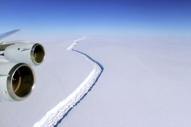
A rift in the Antarctic Peninsula's Larsen C ice shelf is seen Nov. 10, 2016. Dozens of Antarctica’s ice shelves, floating extensions of glaciers, showed significant shrinking between 1997 and 2021, a study published Thursday found.
That melted ice, which usually pens larger glaciers behind it, then goes into the sea. Scientists worry that climate change-triggered melt from Antarctica and Greenland will cause dangerous and significant sea rise over many decades and centuries.
“Knowing exactly how, and how much, ice is being lost from these protective floating shelves is a key step in understanding how Antarctica is evolving,” said University of Colorado ice scientist Ted Scambos, who wasn’t part of the study.
Scambos said the study gives insight into fresh water that’s melting into the Amundsen Sea — “the key region of Antarctica for sea level rise” — that not only adds height to the ocean, but makes it less dense and salty.
The biggest culprits were giant icebergs breaking off in 1999, 2000 and 2002 that were the size of Delaware, he said. The study also looks at ice melting from warm water below.

A satellite image shows icebergs that formed through an ice shelf collapse. Scientists worry that climate change-triggered melt will cause dangerous and significant sea rise.
Ice shelves are floating extensions of glaciers that act “like the gatekeepers” and keep the larger glacier from flowing more quickly into the water, the study’s lead author said.
All told, Antarctic ice shelves lost about 8.3 trillion tons of ice in the 25-year period, the study found. That amounts to around 330 billion tons a year and is similar to previous studies.
But the overall total is not the real story, said study lead author Benjamin Davison, a glaciologist at the University of Leeds in the United Kingdom.

What’s most important, he said, are the patterns of individual shelf loss. The new study shows the deep losses, with four glaciers losing more than a trillion tons on the continent’s peninsula and western side.
“Some of them lost a lot of their mass over time,” Davison said. “Wordie is barely an ice shelf anymore.”
The Wordie ice shelve, which holds back four glaciers near the tip of the Antarctic Peninsula, had a big collapse in 1989, but has lost 87% of its remaining mass since 1997, Davison found. Neighboring Larsen A has lost 73% and Larsen B 57%. The largest of the Larsen ice shelves, Larsen C, has lost 1.8 billion tons of ice, about one-eighth of its mass.
The biggest loss of all is in the Thwaites ice shelf, holding back the glacier nicknamed Doomsday because it is melting so fast and is so big. The shelf has lost 70% of its mass since 1997 — about 4.1 trillion tons — into the Amundsen Sea.
The ice shelves that grew were predominantly on the continent’s east side, where there’s a weather pattern isolates the land from warmer waters, Davison said. The ice shelves on the east were growing slower than the shelves losing ice to the west.
It’s difficult to connect an individual ice shelf loss directly to human-caused climate change, but steady attrition is expected as the world warms, he said.
Read more:


The 20 US cities most threatened by sea level rise
Intro
Updated
Photo Credit: Sean Pavone / Alamy Stock Photo
With global temperatures rising at an alarming rate, climate change has become one of the most pressing issues of our time. A special report released by the Intergovernmental Panel on Climate Change (IPCC) contends that land and ocean ecosystems are already starting to change as a result of high carbon emissions, and it is essential to keep the total global temperature increase below 1.5°C. If carbon emissions and pollution are left unchecked, human necessities like food security, natural resources, and urban development will be in jeopardy.
According to the IPCC report, one of the most drastic effects of climate change is rising sea levels. When sea levels rise, the likelihood of flooding and damage to infrastructure in coastal communities increases. However, not all coastal areas will be equally affected by sea level changes due to differences in topography, man-made barriers, and the distribution of residential and commercial structures.
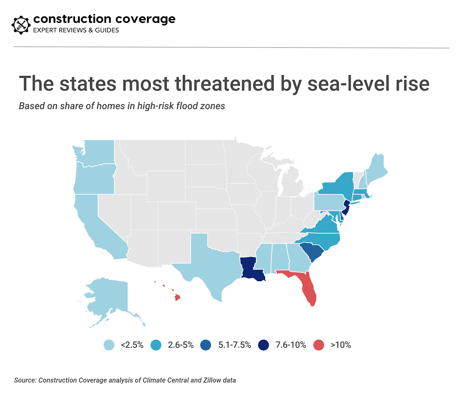
A recent research report by Climate Central and Zillow analyzed these factors to determine which cities and states are most at risk for damage. According to the report, states on the East Coast are generally at a higher risk than those on the West Coast. In particular, 14.6 percent of all homes in Florida and 9.2 percent of homes in New Jersey are located in high-risk flood zones.
Despite the increased risk of flooding, damage, and loss with climate change, housing developers aren’t avoiding low-lying areas. According to the Climate Central and Zillow report, residential construction in high-risk flood zones is outpacing development in safer areas in more than half of U.S. coastal states.
A prime example is New Jersey, where Hurricane Sandy caused more than $70 billion in damage to coastal communities in 2012. Despite this, housing development in the state’s high-risk zones has, in recent years, far outpaced new home construction in safer areas. Other states with disproportionately high development rates in high-risk zones include Maine, New Hampshire, Connecticut, Rhode Island, Delaware, South Carolina, Mississippi, and Hawaii.

To get a more granular view of at-risk communities, Construction Coverage further analyzed the research report conducted by Climate Central and Zillow. Its researchers compiled a list of U.S. cities most threatened by sea-level rise based on the percentage of total housing units projected to be in high-risk zones by the year 2100 (assuming no reduction in carbon emissions).
The final list only includes cities with at least 25 percent of housing units in high risk zones. Notably, eight of the 20 most-at-risk cities are located in Florida and a large majority are located in the South. Here are the U.S. cities most threatened by rising sea levels.
20. Norfolk, VA
Updated
Photo Credit: D Guest Smith / Alamy Stock Photo
- Share of housing in risk zone: 26.6% (15,371 units)
- Share of housing value in risk zone: 35.4% ($4,643,842,605)
- Share of new housing in risk zone: 28.4% (614 units)
- Share of new housing value in risk zone: 32.4% ($221,360,723)
- Population: 245,752
19. Redwood City, CA
Updated
Photo Credit: Andrei Stanescu / Alamy Stock Photo
- Share of housing in risk zone: 30.5% (5,616 units)
- Share of housing value in risk zone: 28.1% ($9,000,683,143)
- Share of new housing in risk zone: 46.9% (68 units)
- Share of new housing value in risk zone: 33.0% ($104,394,023)
- Population: 84,368
18. Hampton, VA
Updated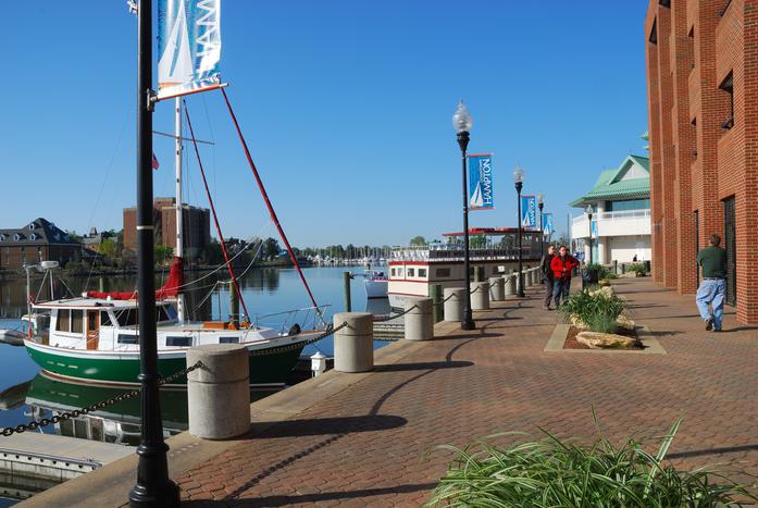
Photo Credit: Will Daniel / Alamy Stock Photo
- Share of housing in risk zone: 31.4% (13,778 units)
- Share of housing value in risk zone: 35.7% ($2,808,529,119)
- Share of new housing in risk zone: 18.6% (151 units)
- Share of new housing value in risk zone: 21.4% ($49,265,020)
- Population: 136,255
17. Urban Honolulu, HI
Updated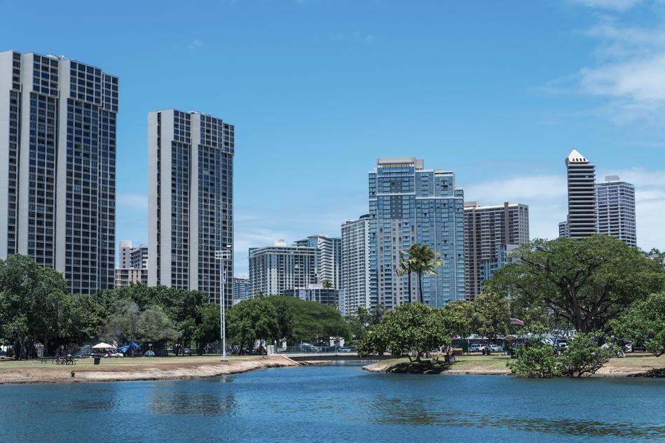
Photo Credit: Gordon Fahey / Alamy Stock Photo
- Share of housing in risk zone: 32.2% (34,266 units)
- Share of housing value in risk zone: 13.9% ($23,401,665,985)
- Share of new housing in risk zone: 4.7% (40 units)
- Share of new housing value in risk zone: 5.2% ($72,922,633)
- Population: 350,788
16. Cambridge, MA
Updated
Photo Credit: Roman Babakin / Alamy Stock Photo
- Share of housing in risk zone: 33.4% (6,951 units)
- Share of housing value in risk zone: 33.7% ($9,085,789,460)
- Share of new housing in risk zone: 43.1% (31 units)
- Share of new housing value in risk zone: 82.7% ($414,580,573)
- Population: 110,893
15. Pompano Beach, FL
Updated
Photo Credit: philipus / Alamy Stock Photo
- Share of housing in risk zone: 34.0% (14,578 units)
- Share of housing value in risk zone: 45.1% ($5,573,881,697)
- Share of new housing in risk zone: 95.3% (41 units)
- Share of new housing value in risk zone: 86.1% ($33,181,407)
- Population: 107,542
14. Mount Pleasant, SC
Updated
Photo Credit: Will Daniel / Alamy Stock Photo
- Share of housing in risk zone: 34.2% (10,267 units)
- Share of housing value in risk zone: 40.1% ($6,823,448,812)
- Share of new housing in risk zone: 51.1% (957 units)
- Share of new housing value in risk zone: 55.2% ($764,179,050)
- Population: 80,661
13. Plantation, FL
Updated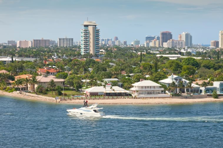
Photo Credit: Ruth Peterkin / Alamy Stock Photo
- Share of housing in risk zone: 34.5% (10,192 units)
- Share of housing value in risk zone: 30.8% ($3,229,026,328)
- Share of new housing in risk zone: 82.1% (78 units)
- Share of new housing value in risk zone: 60.7% ($40,627,866)
- Population: 92,126
12. Miami, FL
Updated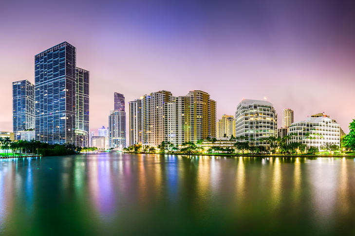
Photo Credit: Sean Pavone / Alamy Stock Photo
- Share of housing in risk zone: 35.0% (37,859 units)
- Share of housing value in risk zone: 35.8% ($18,951,344,215)
- Share of new housing in risk zone: 15.0% (27 units)
- Share of new housing value in risk zone: 46.4% ($197,867,809)
- Population: 443,007
11. Alameda, CA
Updated
Photo Credit: trekandshoot / Alamy Stock Photo
- Share of housing in risk zone: 38.1% (7,057 units)
- Share of housing value in risk zone: 36.0% ($7,265,785,512)
- Share of new housing in risk zone: 51.6% (149 units)
- Share of new housing value in risk zone: 50.4% ($175,870,343)
- Population: 78,246
10. Charleston, SC
Updated
Photo Credit: Sean Pavone / Alamy Stock Photo
- Share of housing in risk zone: 38.6% (17,437 units)
- Share of housing value in risk zone: 49.4% ($10,617,186,228)
- Share of new housing in risk zone: 40.5% (1,547 units)
- Share of new housing value in risk zone: 55.7% ($1,096,697,545)
- Population: 131,204
9. San Mateo, CA
Updated
Photo Credit: Dionigi Pozzi / Alamy Stock Photo
- Share of housing in risk zone: 41.6% (10,890 units)
- Share of housing value in risk zone: 34.3% ($14,592,425,181)
- Share of new housing in risk zone: 67.7% (254 units)
- Share of new housing value in risk zone: 60.8% ($384,397,023)
- Population: 103,500
8. Hollywood, FL
Updated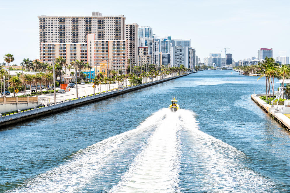
Photo Credit: Kristina Blokhin / Alamy Stock Photo
- Share of housing in risk zone: 45.1% (23,018 units)
- Share of housing value in risk zone: 53.6% ($9,251,338,329)
- Share of new housing in risk zone: 38.3% (46 units)
- Share of new housing value in risk zone: 66.6% ($51,080,854)
- Population: 149,750
7. Fort Lauderdale, FL
Updated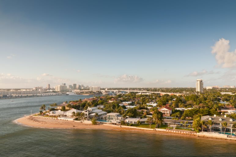
Photo Credit: byvalet / Alamy Stock Photo
- Share of housing in risk zone: 61.2% (40,244 units)
- Share of housing value in risk zone: 65.6% ($23,148,655,526)
- Share of new housing in risk zone: 83.0% (151 units)
- Share of new housing value in risk zone: 82.1% ($552,058,317)
- Population: 177,175
6. Davie, FL
Updated
Photo Credit: Yaroslav Sabitov / Alamy Stock Photo
- Share of housing in risk zone: 64.0% (17,995 units)
- Share of housing value in risk zone: 54.2% ($6,057,281,606)
- Share of new housing in risk zone: 93.2% (123 units)
- Share of new housing value in risk zone: 89.0% ($89,661,044)
- Population: 101,543
5. Hialeah, FL
Updated
Photo Credit: Sean Pavone / Alamy Stock Photo
- Share of housing in risk zone: 64.5% (33,212 units)
- Share of housing value in risk zone: 60.2% ($7,908,923,725)
- Share of new housing in risk zone: 95.1% (626 units)
- Share of new housing value in risk zone: 95.2% ($223,134,520)
- Population: 237,523
4. Hilton Head Island, SC
Updated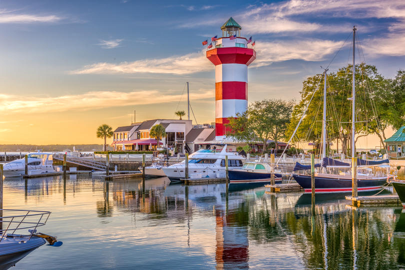
Photo Credit: Sean Pavone / Alamy Stock Photo
- Share of housing in risk zone: 64.7% (17,553 units)
- Share of housing value in risk zone: 67.5% ($11,284,660,028)
- Share of new housing in risk zone: 57.3% (258 units)
- Share of new housing value in risk zone: 67.9% ($317,666,741)
- Population: 39,666
3. Ocean City, MD
Updated
Photo Credit: Cropper / Alamy Stock Photo
- Share of housing in risk zone: 72.7% (20,563 units)
- Share of housing value in risk zone: 71.2% ($6,078,889,499)
- Share of new housing in risk zone: 98.9% (173 units)
- Share of new housing value in risk zone: 97.8% ($78,967,638)
- Population: 7,026
2. Galveston, TX
Updated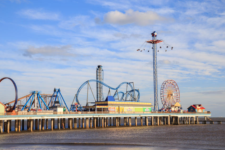
Photo Credit: Duy Do / Alamy Stock Photo
- Share of housing in risk zone: 78.4% (17,581 units)
- Share of housing value in risk zone: 81.5% ($5,047,844,706)
- Share of new housing in risk zone: 93.9% (651 units)
- Share of new housing value in risk zone: 92.9% ($299,225,845)
- Population: 49,706
1. Miami Beach, FL
Updated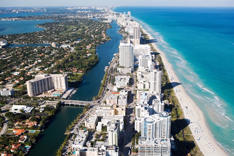
Photo Credit: IS2010-02 / Alamy Stock Photo
- Share of housing in risk zone: 85.2% (40,730 units)
- Share of housing value in risk zone: 84.1% ($37,604,140,241)
- Share of new housing in risk zone: 95.9% (140 units)
- Share of new housing value in risk zone: 95.2% ($1,228,309,663)
- Population: 92,187
Methodology and full results
UpdatedThe data used in this analysis is from a research report conducted by Climate Central and Zillow on the 150 largest coastal cities in the U.S. The research report includes various climate pollution scenarios, including “unchecked pollution,” “moderate carbon cuts,” and “deep carbon cuts.” Risk zones are classified as areas with elevations below local projected sea levels as well as areas with elevations below projected annual flood heights. Low-lying areas protected by topography or levees are excluded.
Real estate data from Zillow includes single-family homes, condominiums, and other multi-unit properties, such as duplexes. Buildings zoned for commercial residential use, such as apartment buildings, are not included. “New housing” refers to housing units built in 2010 or later. For a complete methodology, visit Climate Central.
Population data is from the U.S. Census Bureau 2017 American Community Survey 5-Year Estimates. For the rankings in this article, cities were ordered based on the share of total housing units projected to be in risk zones by the year 2100 assuming “unchecked pollution.” Cities with at least 25 percent of housing units in high risk zones are included in the final list. For a complete list of results, see the original report on Construction Coverage.
July has officially become the hottest month ever recorded
UpdatedBERLIN (AP) — Meteorologists say July was the hottest month measured on Earth since records began in 1880.
The U.S. National Oceanic and Atmospheric Administration said Thursday that July was 0.95 degrees Celsius (1.71 degrees Fahrenheit) warmer than the 20th century average for the month.
The results had been expected after several European countries reported new all-time temperature records in July. Scientists say the upward trend will likely continue because of man-made climate change.

In this file photo dated Thursday, July 25, 2019, a bird sits on a straw bale on a field in Frankfurt, Germany, as the sun rises during an ongoing heatwave in Europe. The U.S. National Oceanic and Atmospheric Administration said Thursday Aug. 15, 2019, that July was the hottest month measured on Earth since records began in 1880. (AP Photo/Michael Probst, FILE)
Last month narrowly topped the previous July record, set in 2016, by 0.03 C (0.05 F)
June of this year had already set a sizzling record for that month over the past 140 years.
The year to date is also 0.95 C (1.71 F) above the long-term average, but still slightly behind 2016.