


The court at McKale Center got a refresh this summer to much fanfare.
The iconic “cactus sunset” logo returned to the hardwood — prominently — after fans narrowly selected the full-color version over a watermark design featuring a silhouette of a saguaro, mountains and a sunset.
The contest to pick the new court design and the revelation of the winning selection stirred strong feelings of nostalgia among Arizona basketball fans who had longed for the cactus sunset to make a comeback.
But does the new look work as intended — especially on TV, where part of the sprawling logo gets cut off by a courtside table and spectators?
With both the UA men and women hitting the halfway point in Big 12 play, we asked that question in the court of public opinion. We got more than 40 responses via the social-media platform X.

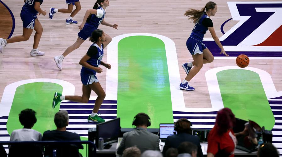
A youth girls basketball team plays on the Lute and Bobbi Olson Court at McKale Center during halftime of Arizona’s women’s game against Kansas State, Feb. 4, 2026, in Tucson.
Predictably, opinions were mixed. Here's what UA fans had to say about the new McKale Center court:
– “It is absolutely fine on TV.” — @BearDownSteven
– “I’m starting to wish the cactus logo was ‘ghosted’ into the floor. I love the cactus logo, but it’s almost a distraction more than an accent piece.” — @RAintheAZ
– “The bottom gets cut off pretty substantially on TV. It still looks cool if you know what you’re looking at, but it could be better.” — @K_Goose97
– “It’s disproportionate. Too large and misplaced. Should be slightly smaller, and the base of the cactus should be on the court, not outside the sideline.” — @jaydubH54
– “Remove the ‘Block A’ from center court and replace it with the cactus and the word 'Arizona' below it. Put the Block A opposite of the Lute (Olson) logos.” — @song_sompa
– “I’m sure I’m in the minority, but the whole court has really grown on me this year.” — @Aaronthewild

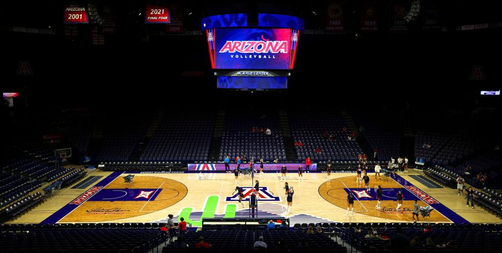
The Arizona volleyball team warms up on the new McKale Center floor, Aug. 16, 2025.
– “The green is always off on TV. Probably because of the LED lighting in the arena.” — @jerzydevil
– “It's great to be up 26 (during the men’s game vs. West Virginia) and debating the logo on the court. Life is good.” — @MajorBurns18
– “No. It doesn’t work. It’s terrible!” — @HurleyFace2022
– “Looks great on TV! One of the best-looking courts in the country, in my opinion.” — @Molinalou520
– “I like the placement, but the color is off. It should be a darker green with spines.” — @FuriosiSomnia
– “Voted No. 2 (the runner-up) but felt the Block A wasn’t needed. I have always thought they should use the Wildcat head that we’ve had since the '80s. It has a toughness to it. The cactus logo is too big. Instead of the logo maybe something even more original like a saguaro forest in a ghost finish.” — @SteveRa19332482
– “I wasn't a fan when they posted that was what they were doing, but it has really grown on me. It looks great!” — @BlakeWilcock

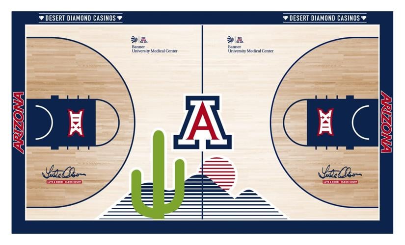
Fans chose this court design, featuring large full-color cactus logo, to be on the McKale Center floor this season.
– “I've grown to love the look. Since you can't pull that first row back to avoid the ‘green alien’ partial obscurity of the cactus, just add some subtle prickles or even a Wildcat-head rose to the top of it (making it clear, on TV, this is a cactus) and it'd be perfect.” — @ProfGWerner
– “Court looks classy, especially when compared to some of the really obnoxious floors some schools have.” — @Risk_n_Reward
– “Good idea. Poor execution.” — @BigXII_Bobby
– “The Block A needs to go away and move it up.” — @match15
– “Yeah, if you're not familiar with the logo, probably wondering what it is on TV. I voted for the large one but next year should try one of the others.” — @mlucey13
– “We think it looks like it’s flipping the bird.” — @abeccac1
– “It’s beautiful ... cactus all day.” — @AndyBraun520

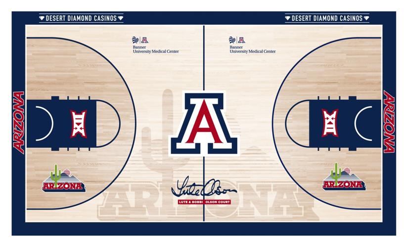
This court design — the runner-up — features a large cactus logo in a silhouette over a light wood floor.
– “I think it looks fine. We have a great-looking court.” — @Shwag92
– “No, I preferred other layout options. The voting was clearly clickbait, though.” — @mkorc
– “It’s too busy.” — @Khjr220
– “It looks fantastic.” — @noahfranc007
– “I love it. Live and on TV.” — @wyo_cat_JH
– “I love the cactus logo, but you're right — it's just not in a good location.” — @sgoodman7
– “The lime green is way off.” — @jaxjohnson1
– “Best court in college basketball.” — @zcat31
– “... I wish the green was a little darker.” — @jessebritchez
– “It’s fire.” — @SamsonKnows
– “No, it’s terrible. Colors and weird green thing need to go.” — @DrizzoFrank
– “Who cares? As long as we win there.” — @Hexforce01